Why build a Design System?
Creating a product or service is exciting, and part of that excitement comes from the feeling of helping others solve the problems they face, but also in the conversations that come from understanding people’s problems and learning from their solutions. For myself building the features for HunnyDo had a lot of architectural decisions that I would not consider very sexy or fun for the average human. Thus the main reason for creating Fernwell was to give the end user something fun to see and interact with while they use the service to get stuff done.
Fernwell represents the beginning of that conversation between the creator and their audience / patrons. It’s the start of building something that makes the user feel like they are using something that was built with them in mind. And while the sample size for users is low at the moment, I hope that as it grows Fernwell can grow with it to become something that solves more design problems in creative ways.
Most importantly for my sanity, Fernwell also solves the problems of how things should appear in the various contexts that HunnyDo operates. Having some consistency and ease of use was crucial to getting web pages and marketing content up and running without having to decide how every little thing should be composed. While it’s still early days for Fernwell I am happy to share it’s goals and objectives and potentially where things are headed in the near future.
Core Foundations & Tokens
Everything in Fernwell traces back to a small set of CSS custom properties defined once, at the root. Think of these as the base constant values that power that cohesive feeling. Ideally, no component — marketing or app — is allowed to hardcode a hex value, a pixel spacing, or a corner radius. If it’s not a token, this means there is a gap in our brand communication and needs to be addressed.
Color architecture
Color in Fernwell splits cleanly into two jobs: brand identity and UI function.
- Marigold (
#FFC145) is the brand color, and we’re strict about it: it appears once per view as the primary action — a “Get started” button, a “Send invoice” button — never as decoration. It’s the one color that stays the exact same hex in both light and dark themes, so it’s the anchor that says “this is HunnyDo” regardless of context. - Plum (
#4C3A73) is the secondary brand color, doing the heavy lifting in navigation, headers, and anywhere the interface needs to feel grounded rather than energetic. - Ink and Cloud — a near-black text color and a warm off-white background — handle roughly 90% of the actual pixels on any given screen. Brand color is a seasoning, not the meal.
- Functional colors are kept entirely separate from brand: Meadow (success), Coral (error), and Sky (info) each pair a saturated foreground with a soft tinted background, so status is always legible at a glance and never confusable with a CTA. Dark mode wasn’t a straight inversion. Neutrals shift from warm cream to a near-black that still carries a trace of Plum’s undertone — true black flattens elevation and reads as a generic “dark mode” reskin rather than the same brand. Status colors get lifted a step lighter in dark mode too, since the same hex that meets contrast on a light background falls short against near-black. The one fixed rule: anything sitting on a Marigold surface (buttons, avatars) always uses a fixed ink color for text, so it never fights the theme toggle.
Typography hierarchy
Fernwell uses three typefaces, each with one job:
- Plus Jakarta Sans (display) — anything that should feel like a voice: headlines, empty states, onboarding copy, marketing hero text.
- Inter (body/UI) — anything the user reads quickly and often: tables, forms, nav, dense app views. High legibility over personality.
- IBM Plex Mono — numbers, invoice IDs, amounts. Anywhere precision matters more than warmth. The split does real work: a marketing headline in Plus Jakarta Sans at 44px carries the “punch” a landing page needs, while the same typeface would be exhausting to read across a table of forty checklist rows — which is exactly why the app’s dense views lean on Inter instead.
Spacing & grid
Every margin, padding, and gap in the system comes from an 8pt spacing scale — 4 · 8 · 12 · 16 · 24 · 32 · 48 · 64 · 96px. It’s a small set of numbers, but it’s the reason a marketing section and a dashboard card can sit in the same visual rhythm even though one is loose and breathing and the other is compact and task-dense. A shape scale rides alongside it — four corner radii from 10px (inputs) up to 32px (modals), plus a full pill radius for avatars and tags — with one governing rule: the bigger the surface, the softer the corner.
Component Taxonomy: Shared vs. Specialized
Rather than maintain two component libraries, Fernwell treats everything as sitting on a spectrum from fully shared to fully specialized.
Shared primitives — buttons, inputs, tags, alerts, toggles, icons — are built once and used everywhere. The icon set alone is a good example of this implementation discipline: every product icon is outline-only, 16–20px, 1.3–1.4px stroke, round caps, currentColor. There’s exactly one exception to the “no fills” rule in the entire system — the checkmark on a completed task — because that’s the one place a filled icon carries real meaning instead of just decoration.
Marketing-specific components — hero sections, pricing tables, testimonial blocks, blog cards — get more room to breathe. Looser padding, higher contrast, bolder copy treatments. Their job is to make a case in a few seconds.
App-specific components — the checklist drawer, the client-link card with its live status dot, the stepper for building a new checklist, status tags with a slight deliberate tilt (the one place in the whole system that’s allowed to feel hand-placed) — are built for repeat use and task completion. Compact, quiet, predictable.
The trick to managing the difference isn’t two design languages — it’s the same primitives with different context settings. A card is always a card: same radius token, same shadow token, same border color. What changes between a pricing card and a dashboard stat card is density (spacing scale step) and emphasis (which text token carries the weight), not the underlying shape language. That constraint is what keeps a marketing page and an app screen from ever feeling like they came from different companies, even when their content and purpose are completely different.
Voice and motion are governed the same way, system-wide rather than per-context: buttons name the action (“Send invoice,” never “Submit”), errors say what happened without apologizing (“That card was declined,” not “Oops!”), and confirmations echo the verb on the button that triggered them. Motion stays restrained everywhere — 120ms on controls, no bounce, no scale-up on modals — with exactly one earned exception: a hand-drawn checkmark animation on genuine success moments, like a checklist item being completed.
Technical Implementation & Tech Stack
This is the part of the story that’s less flashy than a component-library announcement, and we think that’s worth being honest about.
HunnyDo is server-rendered with EJS, styled with plain CSS — no Tailwind, no CSS-in-JS, no component framework, and no frontend build step. Every token in Fernwell is a CSS custom property declared once at the root and inherited everywhere, on the marketing site and inside the app, from the same stylesheet architecture.
That sounds almost old-fashioned next to a typical “Storybook + design tokens JSON + Figma plugin” pipeline, but it buys us something real: there’s no compilation step between changing a token and seeing it everywhere it’s used. Update --marigold-dk in one place, and every hover state across marketing and product picks it up on the next page load. Partial EJS templates play the role a component library would in a React stack — a button partial, a card partial, a status-tag partial — reused across marketing pages and app views alike, so “shared primitive” isn’t just a design concept, it’s a literal shared file.
The tradeoff is real too: no build step means no dead-code elimination, no scoped styles, and no compiler catching a typo’d CSS variable before it ships. This is managed with discipline rather than tooling right now — a single source-of-truth stylesheet, a documented token reference (the same one this post is pulling values from), and a hard rule that no component, marketing or app, hardcodes a raw value. It’s less automated than a token pipeline with build-time validation, but for a product this young, it’s kept the system fast to change and easy for anyone to reason about without learning a build toolchain first.
As HunnyDo grows, this is the area most likely to evolve — not because plain CSS and EJS were wrong, but because the guardrails that discipline currently provides by convention are exactly the kind of thing tooling exists to enforce automatically.
Lessons Learned & Next Steps
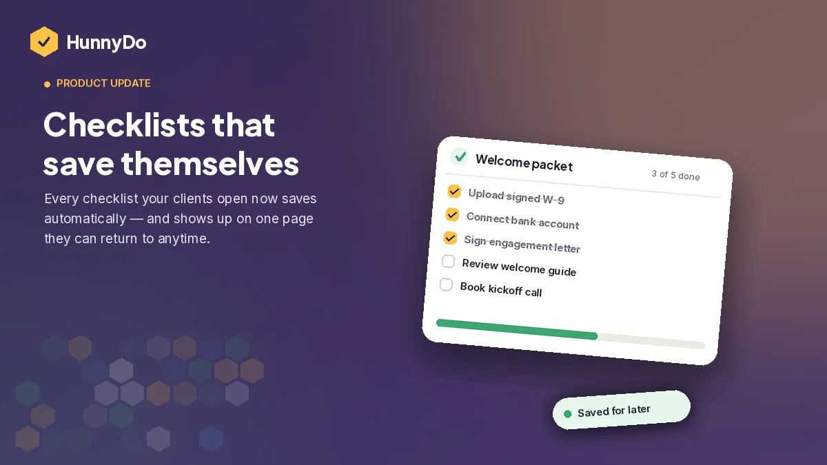
What went well: Once the token layer was in place, new marketing pages and new app views got dramatically faster to build — not because we had more components, but because every new piece of UI could be assembled out of the same small vocabulary of color, spacing, and shape tokens instead of decisions being made from scratch each time. The checklist callout component we use to illustrate blog posts is a good proof point: it’s the literal product component, dropped into an article, requiring zero adaptation.
Challenges we worked through: The hardest part wasn’t defining the tokens — it was resisting the urge to fork a component the first time a marketing page needed something “just slightly different” from the app version. Every fork is a future sync problem. The rule that’s saved us the most: change density and emphasis through existing tokens before reaching for a new variant, and only build a genuinely new component when the behavior, not just the look, actually differs.
What’s next: Dark mode currently lives fully in the product but not yet across every marketing surface — bringing those in line is next. We also want to move some of the manual discipline around “no hardcoded values” into actual tooling — likely a linting step that can catch a raw hex or pixel value in CSS before it merges, without requiring us to adopt a full build pipeline to get there. And as the component set grows, we’re watching for the point where plain EJS partials stop being enough structure on their own — that’s a bridge we’ll cross when duplication starts costing us more than a new tool would.
Fernwell isn’t finished — no design system is — but it’s already doing the one job we built it for: someone can read a checklist guide on our blog, click through, and start building their first checklist without the app ever feeling like it belongs to a different product.